
Serendipity Indeed : The TALLOWIN Edition Project
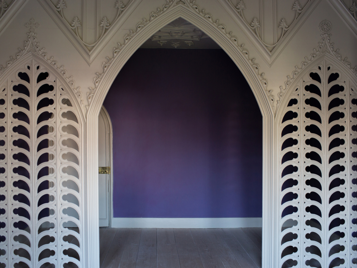
Photo Elena Heatherwick
“Once upon a time, in a land called Serendip lived three princes who were constantly making happy discoveries by accident of things they were not in search of...” *
The worlds we build are the stories we tell, and all stories need a good start. So with that in mind…
Once upon a not-so-long-ago Pedro da Costa Felgueiras, a conservator and leading expert in historic pigments, was asked to repaint – to exacting historical standards – the interior of Strawberry Hill House, the mansion designed by 18th Century polymath Horace Walpole, which trail-blazed the neo-gothic movement. Walpole was a champion of the arts, a man of letters, and a famous Georgian aesthete who in his private correspondence also happened to coin the term “serendipity”, inspired by a certain Persian fairy-tale about three fortunate princes.
At the same time as Pedro was restoring Strawberry Hill, Mark Tallowin was being considered for an award by WALPOLE, the luxury organisation named for Horace Walpole’s father Robert, Britain’s first prime minister and another great patron of the arts. When Mark and Pedro met, neither was aware of the serendipity that linked them, but they recognised a kinship in their approach to craft. This kinship led Mark to invite the conservator to create an artwork for the Tallowin Edition Project.
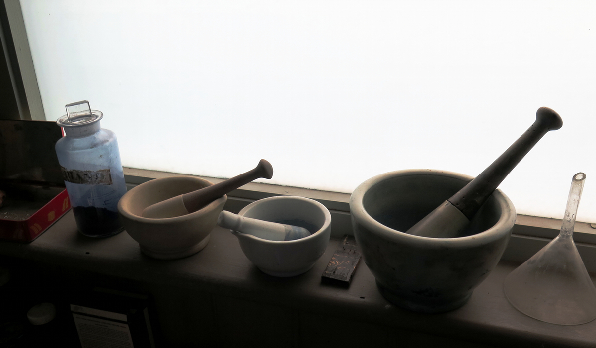
Pedro da Costa Felgueiras' studio interior
Tallowin's Editions Project has seen him commission four artists over the past 12 months, working in collaboration with them to produce four separate collections – “Editions” – which have been released on the equinoxes and solstices of the year.
Maintaining a strong link with the rhythms of nature, is a huge motivating factor behind the project. Before establishing his label, Tallowin worked as a tree surgeon for five years:
“Back then I had a very up-close and personal relationship with the seasons. I’d be up a tree when the first buds came out, because I’d be the one tending them; I’d be up a tree when it snowed. I fell into a certain seasonal way of living, and I didn’t want to lose that.”
But for a designer working day-by-day in the studio, this is easier said than done: “My craft isn't swift; it’s a perpetual, slow-burning, iterative process.” In 2015, for example, he released just a single new handbag design. Inviting others to work with him was a way of reconciling the glacial pace of his work with the year’s natural pulse: something that da Costa Felgueiras understood implicitly when he accepted Tallowin’s offer to collaborate. The paint-maker began to consider ways that his Edition might be able to represent the winter.
The limits Tallowin sets his collaborators are few but strict: their size, their limited number, and of course the immovable deadline of their respective equinox or solstice – release dates are ruthlessly enforced. The designer confessed to finding a certain freedom in rules: “Especially when you get to set those rules yourself!”
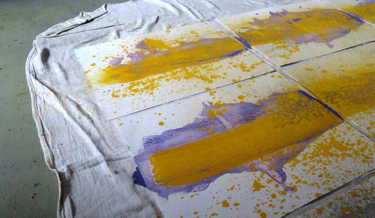
The works Pedro has produced consist of a set of sixteen paintings, each unique in form but sharing a commonality in the paint systems they used: Ecclesiastical Purple and Brilliant Yellow.
“Initially I wanted to use an historical pigment called Indian yellow, which is made of the urine of cow’s fed only on mango leaves,” Pedro told me, “unfortunately you can’t get it anymore because apparently the cows suffered a great deal.” (I wish, by the way, I could include a recording of da Costa Felgueiras’s voice here: it has a deep, Portuguese accented melody, which is utterly compelling and beautiful even when he’s talking about cow urine) (** See footnotes)
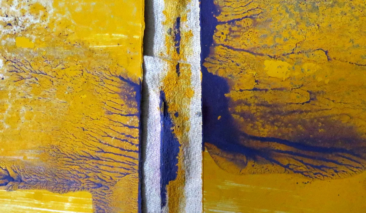
In the end, being forced into using the oil-based paint over the top of the historic water-based one led to favourable results: “The water-based paint doesn’t want to stick to the oil-based paint so you get this transparency,” Pedro said. “It seems linked to the solstice: yellow’s fighting with purple; brightness is fighting against darkness.”
Ecclesiastical Purple is made of two pigments; Cochineal and Blue Verditer. The first of these is an intense red made from ground cochineal beetles. It has a heritage dating back many hundreds of years: once manufactured by the Aztecs and latterly becoming a precious resource fought over by 17th Century European powers. The second is a very special copper compound that needs to be tended into its shade like a delicate crop. Blue Verditer is a labour of love.
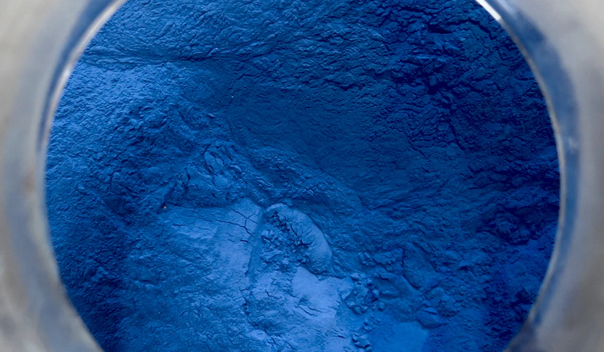
“There’s only one man in the country who still makes it,” Pedro explained. “It takes him three weeks. To get the right pigment it needs to be stored in the cold. This man doesn’t use freezers, though; he uses the winter…. He leaves it in a bucket at the bottom of his garden and he stirs it every hour for about three weeks. He hardly gets any sleep in three weeks.”
Such a profound link to seasonality is exactly what Mark is hoping his Editions Project can achieve. He contrasted it to me with the mainstream fashion industry’s more arbitrary attitude towards yearly change (it was Men’s Fashion Week in London when we talked, a subject that seemed much on his mind): “Just coming up with new products because it’s a different time of year seems a crazy way to work. My business is in the gradual perfection of a limited number of forms. So if I want them to be honest, any new stories have to come from elsewhere.”
Another aspect of the honesty that Mark is talking about surely comes from his dedication to choosing collaborators on “feeling” rather than any pre-assigned criteria. Thus, while there’s been a great variation between the four editions, it’s been accompanied by a real consistency of heart. Before Pedro, Mark worked with fine artist James Stringer, photographer Benedict Redgrove, and graphic designer George Sydney.
“Each project,” said Mark “was very much inspired by what was in the air at the time. The flag design, for example [a silk screen print created by George Sydney as the first of the Editions very shortly after Tallowin had opened his Windmill Street store], that project felt like staking a claim, rallying the troops. It was almost like going to war… I was going to war against mediocre, tedious handbags… It felt meaningful to design a flag.”
And while the Editions may not have directly impacted Tallowin’s bag or wallet designs, he thinks their spirit has infused his business, encouraged him to interact differently with his customers, and made his store feel something more than simply a shop. He wouldn’t call it a gallery, he said, but just having the Editions on display changes the space and broadens conversations he has within it.
The project is also about forming a community, or even, in Mark’s vision for the future, a foundation. “Why should something like this be limited only to the big fashion houses?” he asked. “The Editions Project is about short-circuiting the idea that businesses have to be massive in order to give back to the arts. It’s about creation on a human scale.”
But this Edition Project represents more than just a collaboration between artists. There was a synthesis in the ideals and spirit of the two men that went beyond art, something that I found suggestive of a shared way of seeing the world, encapsulated by a specific kind of passion.
“I’m someone who doesn’t know much about music,” Mark said, “I don’t know anything about politics, but I do have a lot of opinions on cutlery. The things I’m attracted to, the things I know about, I really care about, and I think about on an almost hourly basis. I’ve completely given up on vast swathes of human culture, but the things I do care about, I really go all in.”
Pedro echoed this baulking of mainstream expectations: “If I’d asked people whether I should start working with historical paints, they’d have told me not to bother. But then I didn’t think very much about what I was doing at the time, I just did it out of passion. I did what I thought was important and let other people come to me. I think that’s something that links me with Mark. We’re both doing things in an old fashioned way, in what once seemed a not very commercial way, but there’s a real demand for this kind of stuff in London now. So it is possible to do what you love.”
“Amen,” Tallowin muttered quietly.
It’s an attitude that was shared by the Walpoles themselves. On one of the stain glass windows of Strawberry Hill house was emblazoned the Latin motto: “Fari Quae Sentiat”, that is to say: “Do what you feel.” Serendipity indeed.
Of course, looking further into the future, it’s impossible to know precisely what the Editions Project might become, but hopefully Tallowin and others like him will stumble across plenty more happy discoveries along the way.
